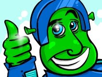
I've been drawing some character art recently for Closure and I was thinking...What if the focused graphics, ground, character, main puzzle objects, etc, stand in too much with the other grayscale graphics? Well, we could just brighten them and make them much brighter. That is one option and I can see it working, but I also played with the idea of maybe trying the old two-tone style on the main graphics and grayscale fogged objects in the background. The two-tone style looks interesting in the fog. More to come though. Hard to see how it will all play out without seeing post-processed graphics all flowing together in-game but I'll test that out a bit later.
(Click to enlarge)


No comments:
Post a Comment