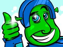
I've been drawing some character art recently for Closure and I was thinking...What if the focused graphics, ground, character, main puzzle objects, etc, stand in too much with the other grayscale graphics? Well, we could just brighten them and make them much brighter. That is one option and I can see it working, but I also played with the idea of maybe trying the old two-tone style on the main graphics and grayscale fogged objects in the background. The two-tone style looks interesting in the fog. More to come though. Hard to see how it will all play out without seeing post-processed graphics all flowing together in-game but I'll test that out a bit later.
(Click to enlarge)
Sunday, July 12, 2009
Sunday, July 5, 2009
Some Game News
Thomas Cross, a writer for Gametopius.com, stopped by my booth at E3 and really enjoyed Closure. So he decided to give us questions! You can read it here.
Also, a game that I did 'box art' for was finally released. It's a very challenging 8-bit style platformer called Lastman. It's meant to be hard with all those fun glitches that old NES titles had. You can download the boxart wallpaper I made for it on my website. Play it for free on Newgrounds.com!
After a couple months of the game just sitting around on PiGPEN's computer, he finally submitted Lastman, a very challenging platformer. It's meant to be hard with all those fun glitches that old NES titles had. You can download the boxart wallpaper I made for it here.
Friday, July 3, 2009
Closure Concept Art
I got back from interning at my Uncle's 3d animation company so now I'm starting work on Closure, at last.
So after long hours of doing doodles and sketches I've found a pretty solid style for the basis of the entire game, and more importantly our first level set, a "Factory". I've begun to do some drawings and we've started talking about how the graphics will be done for the graphical capabilities I wanted to try out for the game. I've been really busy with travel and inevitable personal roadblocks in the past month (and more to go over the next year or so) but I'm working around them.
Alright, well here's a wallpaper of a bunch of concept art mumbo jumbo to bask in for hopefully more than a few days. Here's a link to fullsize: http://www.jonschubbe.com/extra/closureBackgroundFinal.jpg
I'm going to start doing more - more closely related to how the in-game graphics will actually look, work, and feel. I've done a couple but they aren't as accurate as I would like so I have to draw some more stuff that include the small features I need Tyler to add in eventually so I can start playing with his fancy editors he so kindly created for me!
PS. Again, nothing is permanent, not even the title logo (which Tyler alerted me, looks like flOw's title even though I've never played that game, but I guess I probably should sometime...lack of PS3...). However, this is probably the general direction of the art and style of the grayscale system in the game. (Big difference from high contrasted black and white!)
PSS. I don't know why my blog is so skinny looking and all my pictures get cropped but it's weird. If anyone knows how to fix this please do tell!
Subscribe to:
Posts (Atom)